一. 前言
业精于勤, 荒于嬉, 行成于思, 毁于随.
-- 韩愈 < 进学解 >
Python的数据可视库的数量相当多, 以下做简单的梳理.
python数据可视化库主要可分为以下几个类型:
-
传统的图表(这个需求, 绝大部分的库都可以实现)
-
需要交互的图表
-
满足算法/机器学习需要的复杂数据可视化需求
(图: 退火算法的模拟)
通常情况下, 机器学习需要融合一些物理/数学的多维空间的绘图的特性.
-
绘制的载体的差异, 如适合在前端的, 适合在桌面端的.
-
专业对口的图表, 如地理的GIS, 气象, 物理中常用的3D
二. 优先
优先考虑的库应当满足以下要求:
-
上手的容易
-
当前库的维护状态较好(依然还处于相对活跃的维护状态)
-
使用的用户数量(
github上的fork,start等数据亮眼)较多(项目不至于突然中断) -
生态(例如和
pandas, numpy等数据基础适配, 和dash, streamlit等前端数据可视化框架适配)如:
streamlit( web application )原生支持的库:function 含义 st.pyplot 和matplotlib联动 st.altair_chart 和Altair联动 st.vega_lite_chart 和Vega-Lite联动 st.plotly_chart 和plotly联动 st.bokeh_chart 和Bokeh联动 st.pydeck_chart 和PyDeck联动 -
实际生产环境的使用情况(是否需要考虑交互, 是否需要前端部署等)
需要注意的是, 对于商业化应用还需要考虑开源授权的问题.
- matplotlib, 看看, 但不主要用
- saeborn, 个人主力
- pyecharts, 地图交互, 备用
- bokeh
- holoviews
- altair
- plotly
- pyqtgraph
抓取了以上库的GitHub上的一些基本情况(数据时间: 2023-03-21 15:30).
部分信息api示例:
https://api.github.com/repos/pyqtgraph/pyqtgraph/
https://api.github.com/repos/ + 所有者 + 仓库名称
| repos | starts | forks | open_issues | open_prs | contributors | watch | create_at | update_at | github |
|---|---|---|---|---|---|---|---|---|---|
| matplotlib | 17048 | 6775 | 1515 | 330 | 1267 | 591 | 2011-02-19T03:17:12Z | 2023-03-21T04:34:02Z | https://github.com/matplotlib/matplotlib |
| seaborn | 10485 | 1712 | 103 | 10 | 176 | 254 | 2012-06-18T18:41:19Z | 2023-03-21T06:57:12Z | https://github.com/mwaskom/seaborn |
| pyecharts | 13321 | 2770 | 5 | 1 | 36 | 383 | 2017-06-22T02:50:25Z | 2023-03-21T05:32:30Z | https://github.com/pyecharts/pyecharts |
| bokeh | 17383 | 4078 | 666 | 38 | 562 | 447 | 2012-03-26T15:40:01Z | 2023-03-21T05:30:28Z | https://github.com/bokeh/bokeh |
| holoviews | 2397 | 374 | 961 | 41 | 126 | 61 | 2014-05-07T16:59:22Z | 2023-03-19T12:45:30Z | https://github.com/holoviz/holoviews |
| altair | 8113 | 718 | 202 | 21 | 137 | 149 | 2015-09-19T03:14:04Z | 2023-03-21T03:18:34Z | https://github.com/altair-viz/altair |
| plotly | 13115 | 2316 | 1250 | 82 | 205 | 276 | 2013-11-21T05:53:08Z | 2023-03-21T00:13:59Z | https://github.com/plotly/plotly.py |
| pyqtgraph | 3168 | 994 | 318 | 33 | 223 | 152 | 2013-09-12T07:18:21Z | 2023-03-21T04:18:20Z | https://github.com/pyqtgraph/pyqtgraph |
| item | what | weight |
|---|---|---|
| starts | 受到基本认可 | 1 |
| watch | 对这个项目较为感兴趣 | 1.2 |
| forks | 对这个项目有开发的兴趣 | 1.4 |
| open_issues | 使用遇到问题, 或者是建议 | 1.8 |
| open_prs | 参与到这个项目中来(提交bug或者为这个项目提供新的功能) | 2.5 |
| contributors | 真正意义上参与到项目 | 3 |
假设按照一定的权重进行简单打分, 为平衡年份的差异, 以matplotlib的2011年为基准, 2012年的增加权重2, 2017, 则权重为7...如此, y_weight, 对受到时间影响较大的open_issues, open_prs, contributors三项进一步调整权重.
| repos | score | bing_results(cn) |
|---|---|---|
| matplotlib | 4.539016 | 31,100,000 |
| seaborn | 4.166235 | 5,400,000 |
| pyecharts | 4.267057 | 1,520,000 |
| bokeh | 4.471119 | 67,400,000 |
| holoviews | 4.073168 | 481,000 |
| altair | 4.128157 | 55,600,000 |
| plotly | 4.413276 | 7,720,000 |
| pyqtgraph | 3.940203 | 569,000 |
以上内容, 仅供参考, 也许一定程度缓解选择困难的问题.
repos = [
    "malplotlib",
    "seaborn",
    "pyecharts",
    "bokeh",
    "holoviews",
    "altair",
    "plotly",
    "pyqtgraph"
]

scores = [
    4.53901584566781,
    4.16623468176729,
    4.26705668381745,
    4.47111854563224,
    4.0731682622651,
    4.12815684924073,
    4.41327628806936,
    3.94020260373063
]

df = pd.DataFrame()
df['repos'] = repos
df['scores'] = scores

mpl.figure(figsize=(10, 6))
mpl.ylim(3.5, 5)
ax = sns.lineplot(data = df, x='repos', y='scores', marker='^', markeredgecolor='g', markersize='2',markeredgewidth=5).set(title ='Repos of Data Visualization')

for i,  e in enumerate(scores):
    plt.text(i, e, str(round(e, 2)))
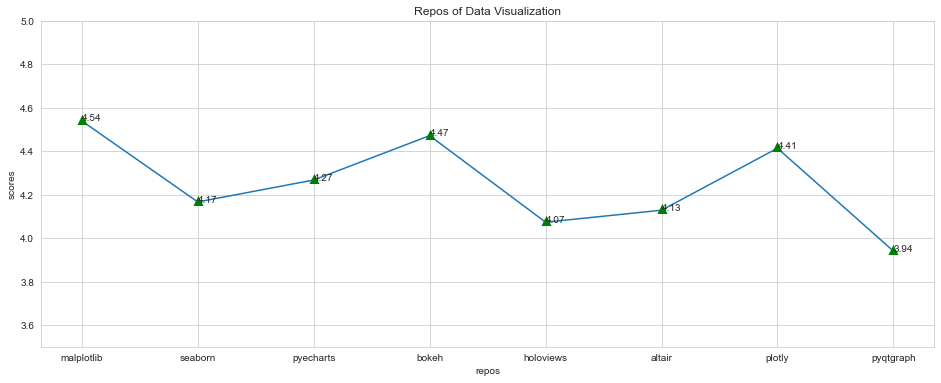
综上, 也能明显看到一个趋势, 对前端友好的, 具有交互能力的库, 整体得到更多的关注和使用. 根据自己的需要, 掌握其中的1 - 2个即可满足绝大部分的需求场景.
2.1 Matplotlib
GitHub statistics:
Matplotlib is a comprehensive library for creating static, animated, and interactive visualizations in Python. Matplotlib makes easy things easy and hard things possible.
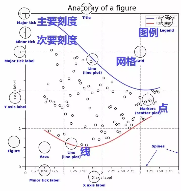
将matplotlib作为python数据可视化的根基不为过, 对于大部分的可视化库, 或多或少受到这个库的影响. 虽然这个库号称makes easy things easy, 但是在实际的使用中, 很多操作还是很麻烦, 原则上不建议在生产环境中使用matplotlib, 但是作为新手可以先用这个库来训练基础, 掌握绘图的一些基础概念和框架, 这些基础在其他库上的实现是类似的.
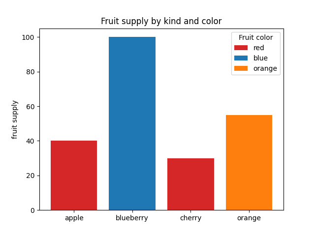
## 同样是实现下面的绘图
# 看看seaborn的差异何在
import matplotlib.pyplot as plt

# figsize, 必须放置于此, 在subplots
fig, ax = plt.subplots(figsize=(10, 6))

fruits = ['apple', 'blueberry', 'cherry', 'orange']
counts = [40, 100, 30, 55]
bar_labels = ['red', 'blue', '_red', 'orange']
bar_colors = ['tab:red', 'tab:blue', 'tab:red', 'tab:orange']

ax.bar(fruits, counts, label=bar_labels, color=bar_colors)

ax.set_ylabel('fruit supply')
ax.set_title('Fruit supply by kind and color')
ax.legend(title='Fruit color')

plt.show()
import matplotlib.pyplot as mpl
import seaborn as sns

mpl.figure(figsize=(10, 6))
fruits = ['apple', 'blueberry', 'cherry', 'orange']
bar_labels = ['red', 'blue', '_red', 'orange']
counts = [40, 100, 30, 55]
# 在实际的使用中, pandas是高频的应用, 数据的载体以pandas作为基础, 更为合理
df = pd.DataFrame(data=[counts], columns=fruits)

# 关键在于此, seaborn将matplotlib的零散的处理(dataframe), 将其整合在一起
ax = sns.barplot(data=df, palette=bar_colors, label=bar_labels)

# 这部分的设置是一样的
ax.set_ylabel('fruit supply')
ax.set_xlabel('fruit kind')
ax.set_title('Fruit supply by kind and color')
ax.legend(title='Fruit color', loc=0)
从上面的简单案例, 可以看到seaborn和matplotlib似乎没什么区别, 但是需要注意 seaborn的强处在于它有大量封装好的模板可以直接使用.
import matplotlib.pyplot as mpl

vegetables = ["cucumber", "tomato", "lettuce", "asparagus",
              "potato", "wheat", "barley"]
farmers = ["Farmer Joe", "Upland Bros.", "Smith Gardening",
           "Agrifun", "Organiculture", "BioGoods Ltd.", "Cornylee Corp."]

harvest = np.array([[0.8, 2.4, 2.5, 3.9, 0.0, 4.0, 0.0],
                    [2.4, 0.0, 4.0, 1.0, 2.7, 0.0, 0.0],
                    [1.1, 2.4, 0.8, 4.3, 1.9, 4.4, 0.0],
                    [0.6, 0.0, 0.3, 0.0, 3.1, 0.0, 0.0],
                    [0.7, 1.7, 0.6, 2.6, 2.2, 6.2, 0.0],
                    [1.3, 1.2, 0.0, 0.0, 0.0, 3.2, 5.1],
                    [0.1, 2.0, 0.0, 1.4, 0.0, 1.9, 6.3]])

# 执行的细节太多, 太浪费时间
mpl.xticks(np.arange(len(farmers)), labels=farmers,
                     rotation=45, rotation_mode="anchor", ha="right")
mpl.yticks(np.arange(len(vegetables)), labels=vegetables)

mpl.title("Harvest of local farmers (in tons/year)")

mpl.imshow(harvest)

mpl.colorbar()

mpl.tight_layout()

mpl.show()
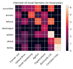
# 通常而言, 多数时候, 并不希望花太多时间在这些细节上
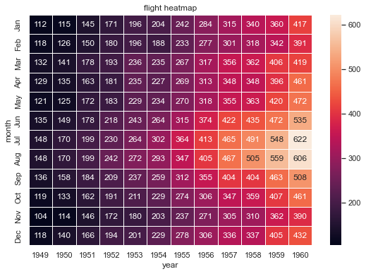
# 设置主题
sns.set_theme()
# 载入数据
flights_long = sns.load_dataset("flights")
# 如无法加载
# https://codeload.github.com/mwaskom/seaborn-data/zip/refs/heads/master
# 下载文件, 释放到user之下的seaborn-data文件夹之下, 即可
flights = flights_long.pivot("month", "year", "passengers")
# 相比于上面的matplotlib, seaborn将需要手动逐个处理的内容, 直接封装起来归于sns.heatmap
f, ax = mpl.subplots(figsize=(9, 6))
mpl.title('flight heatmap')
sns.heatmap(flights, annot=True, fmt="d", linewidths=.5, ax=ax)
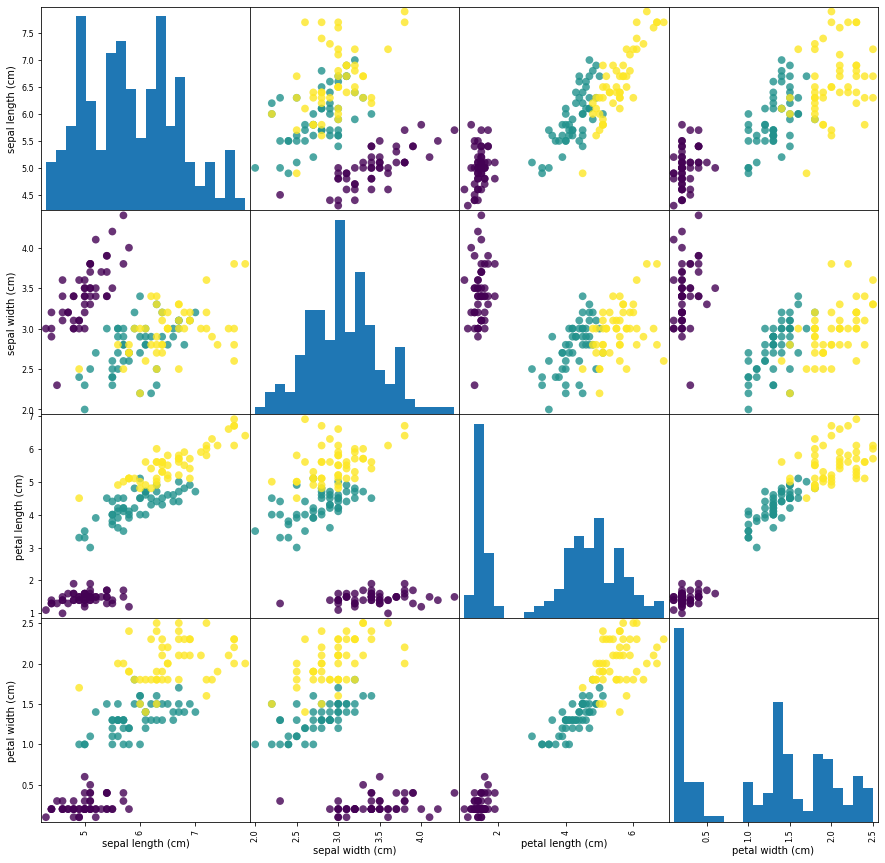
2.2 Seaborn
GitHub statistics:
| 特点 | Matplotlib | Seaborn |
|---|---|---|
| 功能 | 它用于制作基本图形. 数据集在条形图 直方图 饼图 散点图 线条等的帮助下可视化. | Seaborn 包含许多用于数据可视化的模式和图表. 它使用迷人的主题. 它有助于将整个数据编译成一个图. 它还提供数据分布. |
| 语法 | 它使用比较复杂和冗长的语法. 示例: bargraph-matplotlib.pyplot.bar(x_axis, y_axis) 的语法. |
它使用相对简单的语法 更容易学习和理解. 示例: bargraph-seaborn.barplot(x_axis, y_axis) 的语法. |
| 处理 | 多个图形可以同时打开和使用多个图形. 但是 它们明显关闭. 一次关闭一个图形的语法: matplotlib.pyplot.close(). 关闭所有图形的语法: matplotlib.pyplot.close("all") |
Seaborn 为每个图形的创建设置时间. 但是 它可能会导致(OOM)内存不足问题 |
| 可视化 | Matplotlib 与 Numpy 和 Pandas 很好地连接 并充当 python 中数据可视化的图形包. Pyplot 提供与 MATLAB 类似的功能和语法. 因此 MATLAB 用户可以轻松学习它. | Seaborn 更擅长处理 Pandas 数据帧. 它使用基本的方法集在 python 中提供漂亮的图形. |
| 柔韧性 | Matplotlib 是一个高度定制且强大的 | Seaborn 借助其默认主题避免了绘图重叠 |
| 数据框和数组 | Matplotlib 有效地处理数据框和数组. 它将图形和轴视为对象. 它包含用于绘图的各种有状态 API. 因此 类似 plot() 的方法可以在没有参数的情况下工作. |
Seaborn 比 Matplotlib 更具功能性和组织性 并将整个数据集视为一个单元. Seaborn 不是那么有状态 因此在调用 plot() 等方法时需要参数 |
| 用例 | Matplotlib 使用 Pandas 和 Numpy 绘制各种图形 | Seaborn 是 Matplotlib 的扩展版本 它使用 Matplotlib 以及 Numpy 和 Pandas 绘制图形 |
Seaborn is a Python data visualization library based on matplotlib. It provides a high-level interface for drawing attractive and informative statistical graphics.
seaborn是建立在matplotlib之上的, 对后者的使用进行了强化, 更为易用, 提供了更为丰富的图表的直接支持(只需要少量的代码), 生产环境, 建议使用seaborn来替代matplotlib
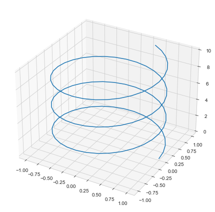
import pandas as pd
import numpy as np
import seaborn as sns
# 设置风格
sns.set_style("whitegrid")
# 模拟数据
OMEGA = 2
Z1 = np.linspace(0, 10, 100)
X1 = np.cos(OMEGA*Z1)
Y1= np.sin(OMEGA*Z1)
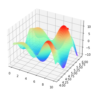
# 设置图大小
mpl.figure(figsize=(10,6))
# 设置为3D
axes = mpl.axes(projection='3d')
axes.plot3D(X1,Y1,Z1)
# 调整布局
mpl.tight_layout()
mpl.show()
选择seaborn作为主力的考量
- 背靠大树(
matplotlib),matplotlib作为高度成熟的产品, 变化不会像其他的一些新锐的库那样频繁(各种api都相对规范和稳定), 例如pyecharts, 大版本的迭代导致大量的代码需要重写. - 满足绝大部分的场景需求
matplotlib, 基本被各种外部的扩展库所支持, 生态完备.
2.3 [Pyecharts](https://gallery.pyecharts.org/### 2.3 /)
GitHub statistics:
A Python Echarts Plotting Library.
- Chart: 30+ kinds of charts
- Map: 300+ Chinese cities / 200+ countries and regions
- Platforms: Pure Python / Jupyter Notebook / Web Framework
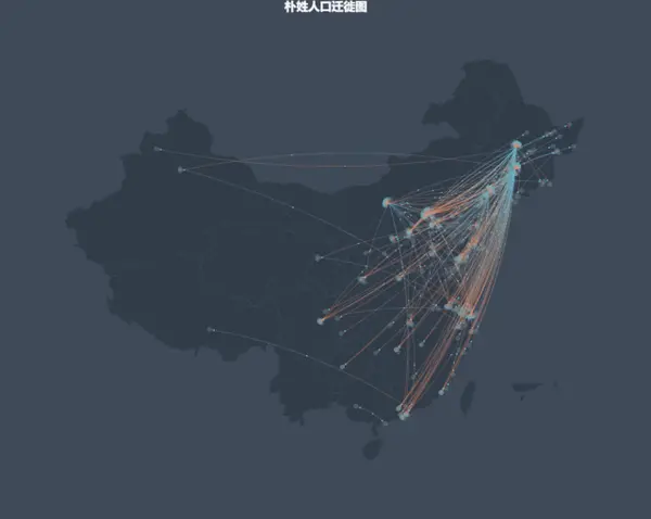
了解百度春节人口迁移图的用户应该对于这个库不陌生, 这个库就是大名鼎鼎Apache ECharts的python的实现, 特别强调了其绘制地图相关的数据可视化的优势.
(目前该项目已经从百度脱离(捐赠), 由阿帕奇基金会负责管理)
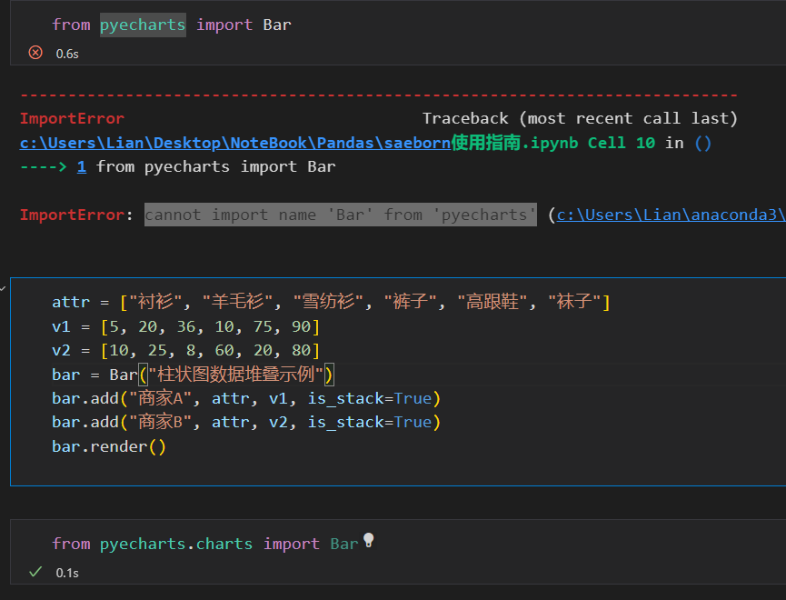
这是个很不错的可视化库, 但是其文档有点混乱, 加上版本迭代后, 代码出现了很多不兼容的情况.
在其中的一个官方文档上, 随手找一个示例, 这种文档在使用搜索引擎检索时, 经常会查到这种旧版本的内容
v0.5.x 和 V1 间不兼容 V1 是一个全新的版本 详见 ISSUE#892 ISSUE#1033.
V 0.5.x
支持 Python2.7 3.4+
经开发团队决定 0.5.x 版本将不再进行维护 0.5.x 版本代码位于 05x 分支 文档位于 05x-docs.pyecharts.org.
V 1
仅支持 Python3.6+
新版本系列将从 v1.0.0 开始 文档位于 pyecharts.org; 示例位于 gallery.pyecharts.org
V 2
仅支持 Python3.6+
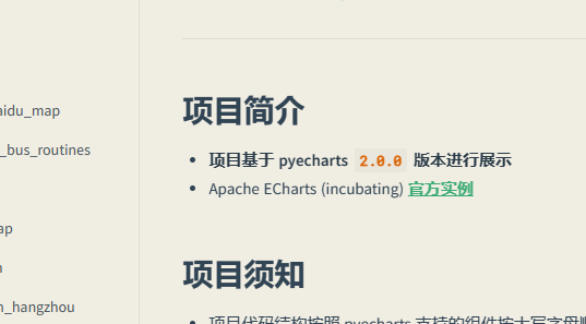
新版本基于 Echarts 5.4.1+ 进行渲染, 文档和示例位置与 V1 相同
注意新版本的文档地址: 中文简介 - Document (pyecharts.org)
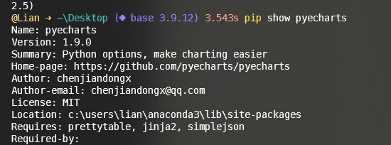
华为的镜像站点还是1.9
# 默认使用的是华为的镜像
# 最新版本仅为1.9
@Lian ➜ ~\Desktop ( base 3.9.12) 2.85s pip install --upgrade pyecharts
Looking in indexes: https://repo.huaweicloud.com/repository/pypi/simple
Requirement already satisfied: pyecharts in c:\users\lian\anaconda3\lib\site-packages (1.9.0)
Requirement already satisfied: simplejson in c:\users\lian\anaconda3\lib\site-packages (from pyecharts) (3.18.0)
Requirement already satisfied: jinja2 in c:\users\lian\anaconda3\lib\site-packages (from pyecharts) (2.11.3)
Requirement already satisfied: prettytable in c:\users\lian\anaconda3\lib\site-packages (from pyecharts) (3.5.0)
Requirement already satisfied: MarkupSafe>=0.23 in c:\users\lian\anaconda3\lib\site-packages (from jinja2->pyecharts) (2.0.1)
Requirement already satisfied: wcwidth in c:\users\lian\anaconda3\lib\site-packages (from prettytable->pyecharts) (0.2.5)
# 手动指定回官方的源地址
pip install --upgrade pyecharts -i https://pypi.Python.org/simple/
from pyecharts import options as opts
from pyecharts.charts import Bar
from pyecharts.faker import Faker

c = (
    Bar()
    .add_xaxis(Faker.choose())
    .add_yaxis("商家A", Faker.values())
    .add_yaxis("商家B", Faker.values())
    .set_global_opts(title_opts=opts.TitleOpts(title="Bar-基本示例", subtitle="我是副标题"))
    .render_notebook()
)
即可得到一个可交互的图表.
from pyecharts import Map

value = [155, 10, 66, 78]
attr = ["福建", "山东", "北京", "上海"]
map = Map("全国地图示例", width=1200, height=600)
map.add("", attr, value, maptype='china')
map.render()

同样绘制一个热力图
import random
from pyecharts import options as opts
from pyecharts.charts import HeatMap
from pyecharts.faker import Faker

value = [[i, j, random.randint(0, 50)] for i in range(24) for j in range(7)]
c = (
    HeatMap()
    .add_xaxis(Faker.clock)
    .add_yaxis(
        "series0",
        Faker.week,
        value,
        label_opts=opts.LabelOpts(is_show=True, position="inside"),
    )
    .set_global_opts(
        title_opts=opts.TitleOpts(title="HeatMap-Label 显示"),
        visualmap_opts=opts.VisualMapOpts(),
    )
    .render_notebook()
)
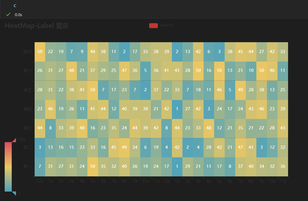
保存图片麻烦点, 这是可交互的web元素.
2.4 Bokeh
GitHub statistics:
Bokeh is a Python library for creating interactive visualizations for modern web browsers. It helps you build beautiful graphics, ranging from simple plots to complex dashboards with streaming datasets. With Bokeh, you can create JavaScript-powered visualizations without writing any JavaScript yourself.
from bokeh.models import ColumnDataSource
from bokeh.plotting import figure, show
from bokeh.sampledata.commits import data
from bokeh.transform import jitter

DAYS = ['Sun', 'Sat', 'Fri', 'Thu', 'Wed', 'Tue', 'Mon']

source = ColumnDataSource(data)

p = figure(width=800, height=300, y_range=DAYS, x_axis_type='datetime',
           title="Commits by Time of Day (US/Central) 2012-2016")

p.scatter(x='time', y=jitter('day', width=0.6, range=p.y_range),  source=source, alpha=0.3)

p.xaxis.formatter.days = '%Hh'
p.x_range.range_padding = 0
p.ygrid.grid_line_color = None

show(p)
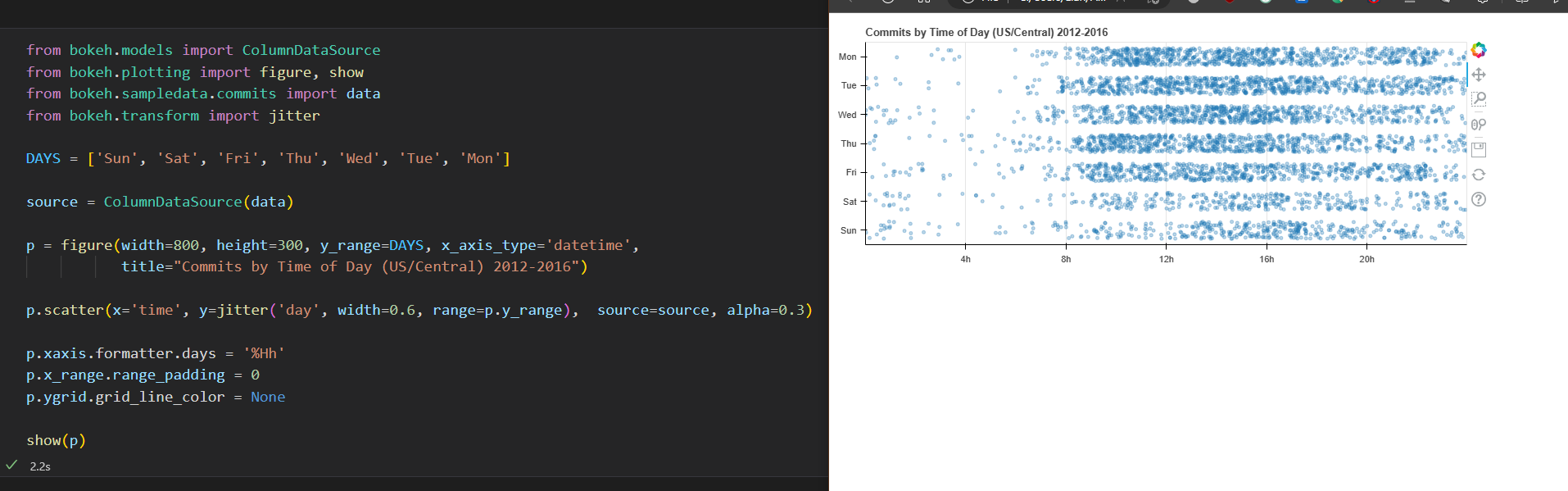
图可以直接渲染到html文件上
2.5 Altair
GitHub statistics:
Vega-Altair is a declarative statistical visualization library for Python, based on Vega and Vega-Lite.
import altair as alt
from vega_datasets import data

source = data.movies.url

alt.Chart(source).mark_rect().encode(
    alt.X('IMDB_Rating:Q', bin=alt.Bin(maxbins=60)),
    alt.Y('Rotten_Tomatoes_Rating:Q', bin=alt.Bin(maxbins=40)),
    alt.Color('count():Q', scale=alt.Scale(scheme='greenblue'))
)

import pandas as pd

pd.read_json(source)
| Title | US_Gross | Worldwide_Gross | US_DVD_Sales | Production_Budget | Release_Date | MPAA_Rating | Running_Time_min | Distributor | Source | Major_Genre | Creative_Type | Director | Rotten_Tomatoes_Rating | IMDB_Rating | IMDB_Votes | |
|---|---|---|---|---|---|---|---|---|---|---|---|---|---|---|---|---|
| 0 | The Land Girls | 146083.0 | 146083.0 | NaN | 8000000.0 | Jun 12 1998 | R | NaN | Gramercy | None | None | None | None | NaN | 6.1 | 1071.0 |
| 1 | First Love, Last Rites | 10876.0 | 10876.0 | NaN | 300000.0 | Aug 07 1998 | R | NaN | Strand | None | Drama | None | None | NaN | 6.9 | 207.0 |
| 2 | I Married a Strange Person | 203134.0 | 203134.0 | NaN | 250000.0 | Aug 28 1998 | None | NaN | Lionsgate | None | Comedy | None | None | NaN | 6.8 | 865.0 |
| 3 | Let's Talk About Sex | 373615.0 | 373615.0 | NaN | 300000.0 | Sep 11 1998 | None | NaN | Fine Line | None | Comedy | None | None | 13.0 | NaN | NaN |
2.6 Plotly
GitHub statistics:
Plotly's Python graphing library makes interactive, publication-quality graphs. Examples of how to make line plots, scatter plots, area charts, bar charts, error bars, box plots, histograms, heatmaps, subplots, multiple-axes, polar charts, and bubble charts.
这是一个非常值得关注的库, 其开发者为Dash(相当流行的数据可视化前端库)的同一开发者. 可以平滑延申到dash.
import plotly.express as px

# 一个dataframe, pandas
data_canada = px.data.gapminder().query("country == 'Canada'")

fig = px.bar(data_canada, x='year', y='pop')
fig.show()
和pyecharts一样, 渲染后得到的是可交互的图表.
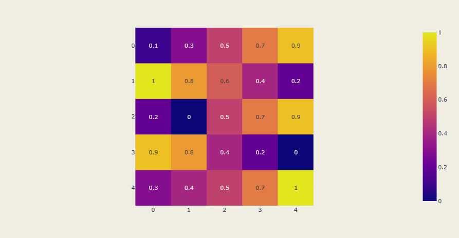
同样绘制一张热力图
import plotly.express as px

z = [[.1, .3, .5, .7, .9],
     [1, .8, .6, .4, .2],
     [.2, 0, .5, .7, .9],
     [.9, .8, .4, .2, 0],
     [.3, .4, .5, .7, 1]]

fig = px.imshow(z, text_auto=True)
fig.show()
2.7 HoloViews
GitHub statistics:
HoloViews is an open-source Python library designed to make data analysis and visualization seamless and simple. With HoloViews, you can usually express what you want to do in very few lines of code, letting you focus on what you are trying to explore and convey, not on the process of plotting.
2.8 PyQtGraph
GitHub statistics:
PyQtGraph is a pure-python graphics and GUI library built on PyQt / PySide and numpy. It is intended for use in mathematics / scientific / engineering applications. Despite being written entirely in python, the library is very fast due to its heavy leverage of NumPy for number crunching and Qt's GraphicsView framework for fast display. PyQtGraph is distributed under the MIT open-source license.
PyQtGraph是相对少的一个库, 专门针对本地应用pyqt开发的.
三. 其他
四. 小结
在Python数据处理的优势一文中曾提及, python的其中的优势在于强大的生态支持, 从数据可视化库的庞大和用途的广泛可见一斑.
4.1 B站上的情形
补充这部分的信息, 忘了面向B站学习, 来看看B站上关于上述优先内容的检索情况.
| repos | search_results(pages) | > 60 | normal |
|---|---|---|---|
| matplotlib | 34 | 34 | 0 |
| seaborn | 19 | 10 | 9 |
| pyecharts | 15 | 3 | 12 |
| bokeh | < 3 (大部分是非相关内容) | < 1 | 1 |
| holoviews | 0 | 0 | 0 |
| altair | < 1 | 0 | 0 |
| plotly | 10 | 2 | 8 |
| pyqtgraph | 2 | < 1 | 0 |
从检索内容来看, 绝大部分超长(大于60分钟)内容是培训机构发布的低质低效视频, 这部分不纳入考虑范围.
鉴于matplotlib已经被培训机构的信息所覆盖(从这里可以看到培训机构的无能和低效), 将其剔除掉.
seaborn, plotly, pyecharts在实际生产中更应该得到关注.